Spotify Front Left


Client
Spotify
What
Visual Identity
Studio Herrström
Erik Herrström
Thomas Neulinger
Matouš Marťák
Marcell Gulyas
Kara Griffin Cushman
Kerstin Herrström
Spotify
Shahin Haghjou
Amelia Jenner
Alicia Sbrugnera
Michelle Pham
Loren Lee
Project Images
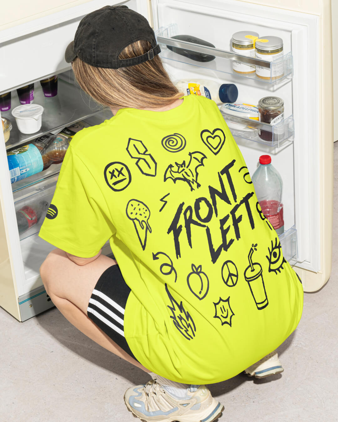
Front Left has always been more than just a playlist—it’s a movement, a tastemaker, and a space where indie music thrives. But as indie culture evolves, so must its most influential platforms. In collaboration with Spotify, Studio Herrström has reimagined Front Left with a bold new visual identity, transforming it from a music destination into a cultural hub for indie fans. Inspired by the raw creativity of DIY zines and the unfiltered energy of the indie scene, the new design system blends hand-drawn typography, doodles, and vibrant colors to reflect the playlist’s progressive, boundary-pushing spirit. This evolution cements Front Left not just as the flagship for Australia and New Zealand’s best indie artists but as a living, breathing reflection of the culture surrounding them.
The challenge was to evolve Front Left from a flagship indie playlist into a broader cultural hub that resonates with fans beyond music. While already an influential space for indie listeners, the playlist needed a refresh to stay relevant and engaging. The goal was to make Front Left more reactive to cultural moments—aligning with major tours, festivals, trending content, and even astrology—while refining its tastemaker identity. Another key challenge was balancing fresh discoveries with nostalgic catalog moments, ensuring older tracks found new context.
We collaborated closely with Spotify’s global and Australian teams and editors to uncover the symbols, imagery, and cultural references that resonate with the indie community. Drawing from the essence of DIY culture and the raw energy of indie zines, we crafted a visual identity that feels unpolished, expressive, and deeply connected to the scene. The design is completely created with hand-drawn doodles and a playful, custom-drawn logotype—all inspired by Australian indie music culture.
At the heart of the rebrand is a toolkit of 40 bespoke doodles, each reflecting different aspects of indie culture, from music and festivals to pop culture and collaboration. This modular design system allows each playlist cover and layout to express a unique mood while maintaining a cohesive identity. Color plays a crucial role, with Spotify’s vibrant palette amplified by bold contrasts and textured elements that embrace the unfiltered charm of DIY aesthetics. The result is a design that feels alive, daring, and undeniably indie—just like the artists and fans it represents.
The flexibility of the new design system allows the Front Left brand to adapt to various contexts—whether it’s a playlist cover, social media campaign, or off-platform activations like artist collaborations or festival moments. Spotify Australia has already featured the playlist in out of home billboards in Sydney.
The refreshed Front Left is more than a playlist—it’s a cultural hub where fans, artists, and tastemakers converge. The rebrand cements its role as a tastemaker, reflecting the audience’s love for pop culture, festivals, and online trends while keeping its pulse on emerging sounds and cultural moments. Designed for 18- to 35-year-olds, it blends playfulness, relatability, and a bit of edge, creating a sense of belonging while encouraging listeners to explore the fringes of indie music. With this evolution, Front Left remains a progressive platform that resonates with its growing international community.
Front Left continues to embrace its unique tagline: music that’s hard to define but easy to love.


