Client

Services
Overview
Outcome
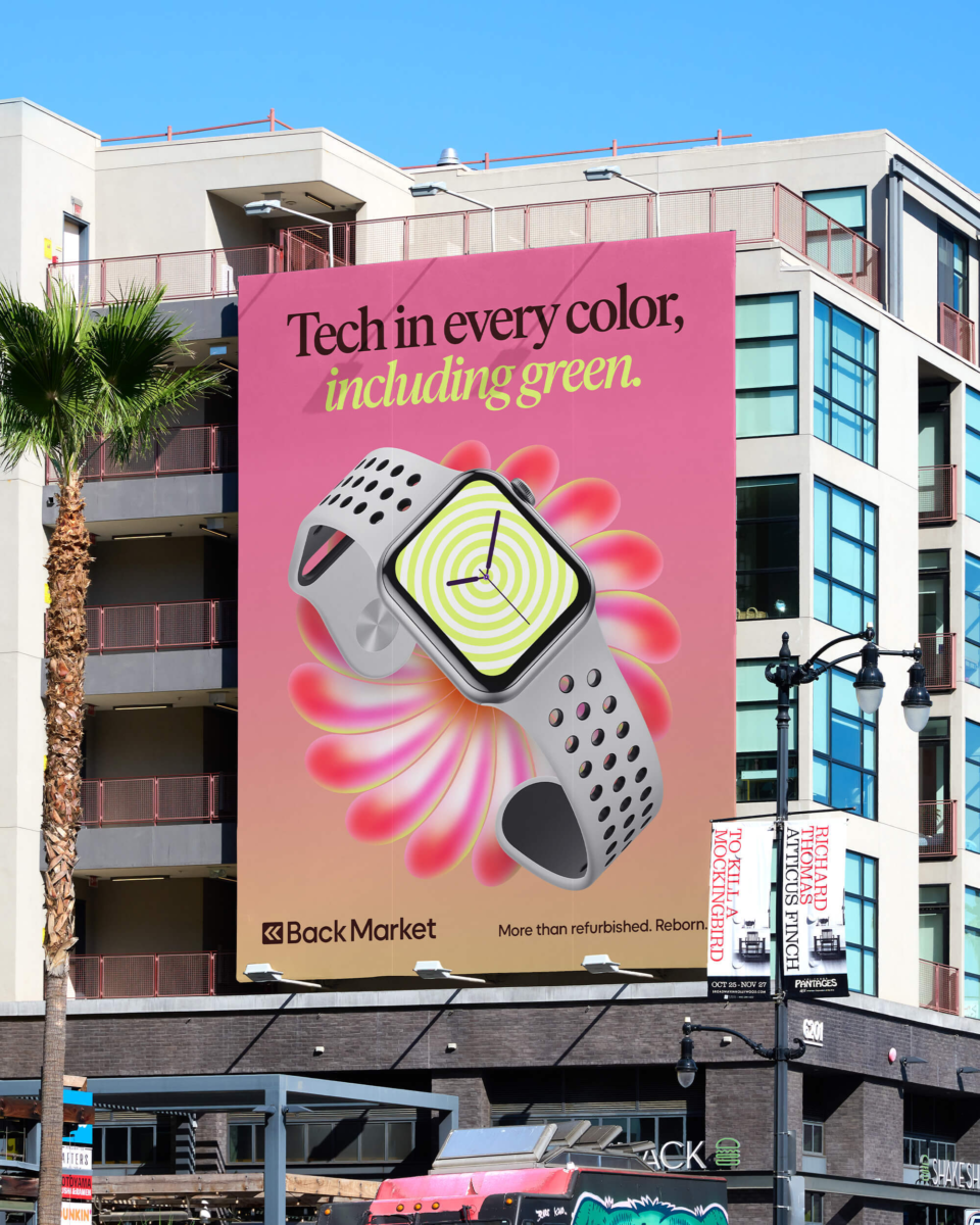
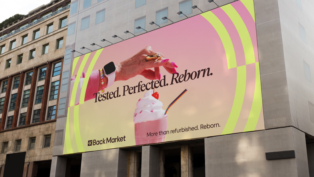
The rebrand launched with a global campaign that built Back Market’s presence in the US.

Partnership summary
We partnered with Back Market to rebrand and simplify the refurbished tech experience through a refreshed visual identity.

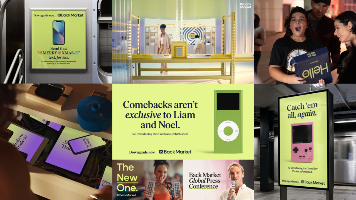
Press
Press Images
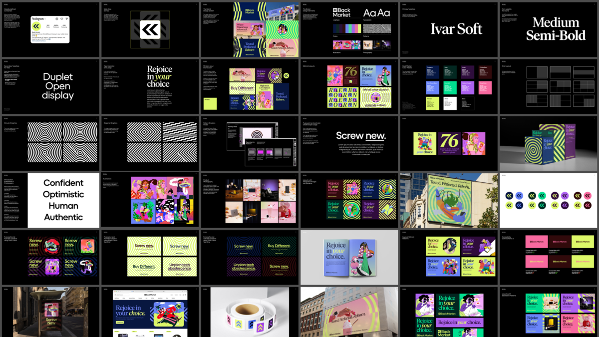
Visual Identity
- Studio Herrström
Motion Identity
- Vucko
Back Market
- Dan Brill
- Vianney Vaute
- Lucile Dumeaux
- Seth Farbman
- Donatienne Vaute
- Adam Pasulka
- Clare Austen Smith
- Rachel Stone
- Flore Lajouanie
- Hannah Laloum
- Manon Chrétien
- Valentin Lachayze
- Florian Lissot
- Ray Ho
Sound Design
- Sanctus
Project Information
Back Market is reshaping the way consumers buy technology. As the leading marketplace for refurbished tech, their mission is to reduce e-waste and extend the lifespan of electronics—making tech more sustainable and affordable.
As Back Market scaled globally, their visual identity needed to evolve. STUDIO HERRSTRÖM joined forces with their in-house agency to lead a comprehensive design system refresh. The objective: reflect Back Market’s optimism, offbeat personality, and growing influence, while grounding the brand in the principles of circularity.
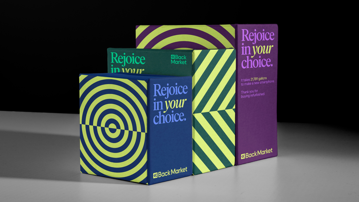
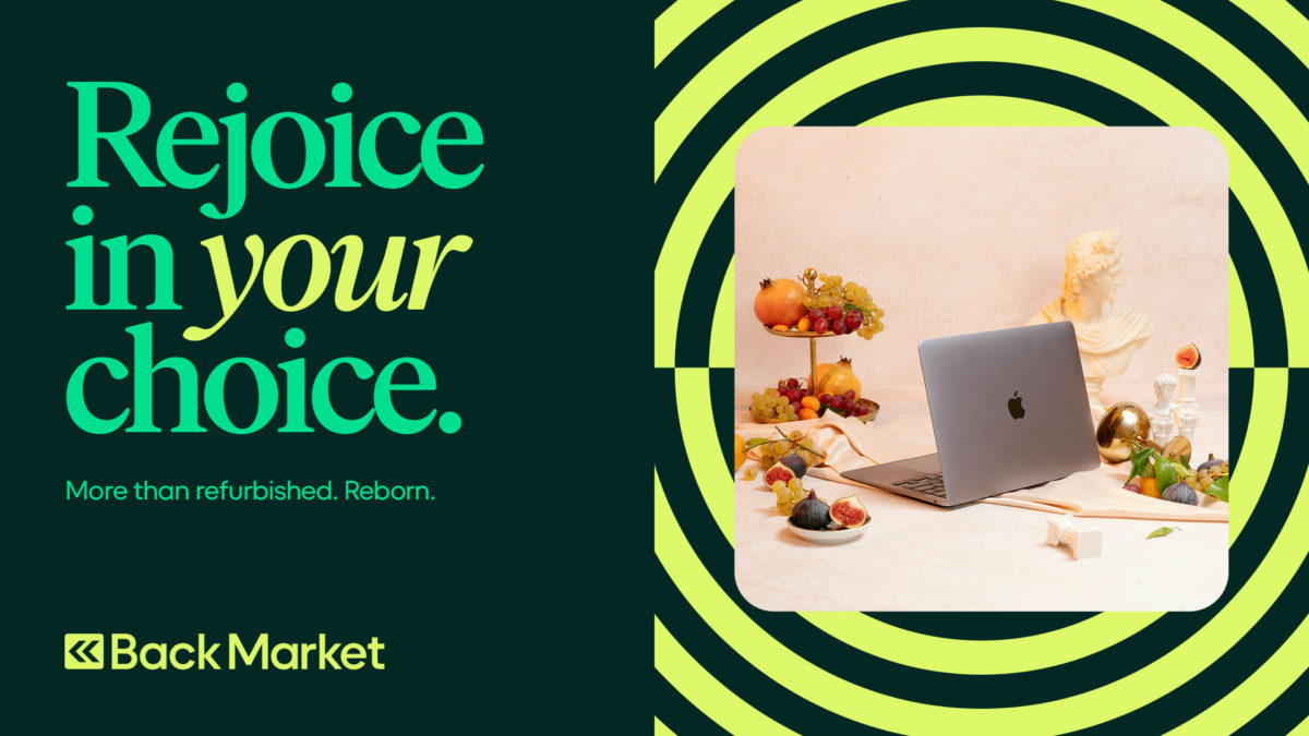
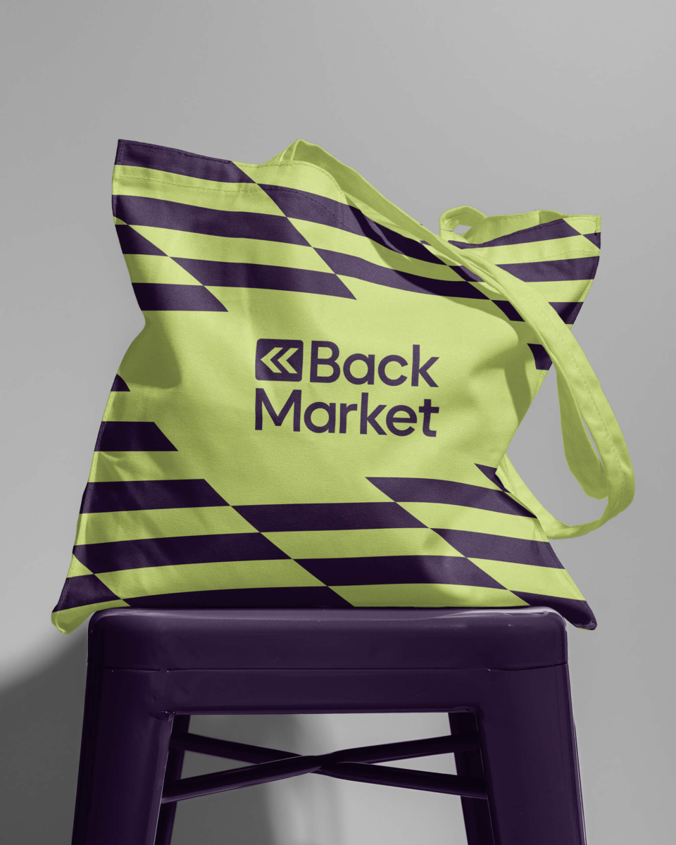
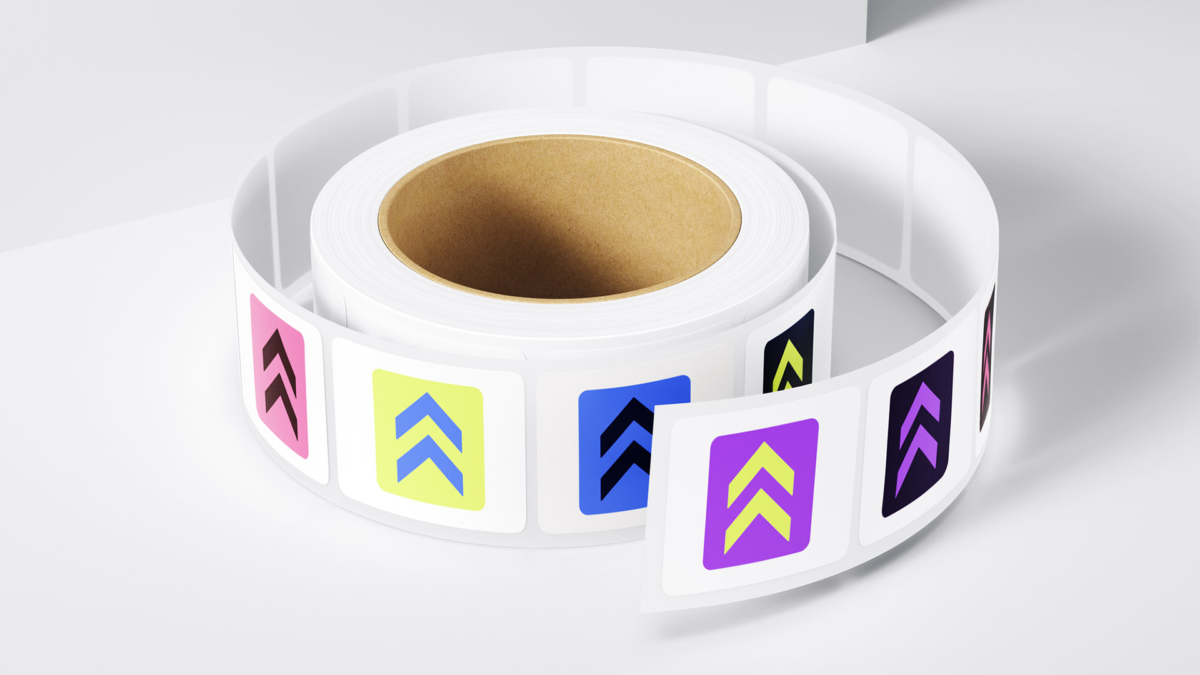
We redrew the logotype for clarity and approachability. New circular patterns were introduced across the identity—signaling renewal and lifecycles. Diagonal elements added a sense of optimism and forward momentum, echoing Back Market’s chevron icon.
Motion-partner Vucko developed and brought the design system to life through circular movement—adding dimension to the identity and reinforcing the message of reuse. Typography choices balanced warmth and geometry: Ivar Soft brought a human tone, while Duplet Open introduced structure and continuity with the circular theme.
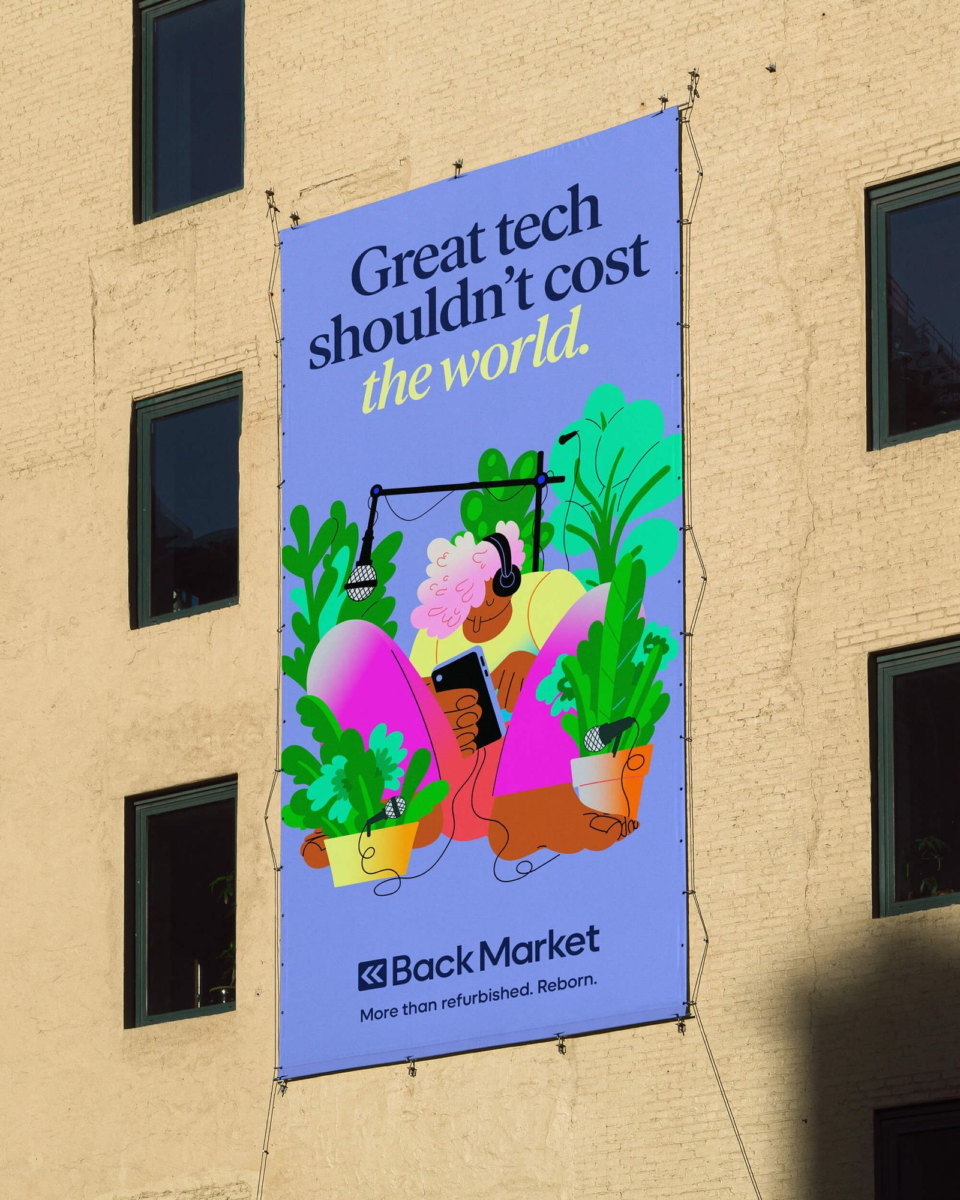
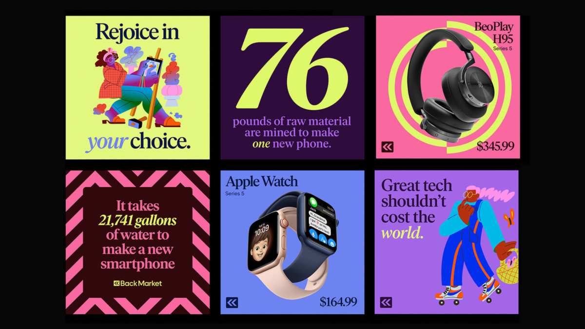
The identity system was designed for flexibility—scaling across packaging, photography, illustration, and brand partnerships. Activistic visual elements were created to support sharper campaign messaging and advocacy efforts.
We also supported the Back Market team in shaping a global art direction—anchored in confidence, optimism, and authenticity. Collaborations with international artists gave the brand a more inclusive and culturally attuned voice.