
Client

Services
Overview
Partnership Summary
- We worked with NOCS to match its brand identity with their audio products that combine simple, minimalist Scandinavian design with superb quality and durability.
In memoriam
- In memory of Daniel Alm, with gratitude for the collaboration and the work we created together.
STUDIO HERRSTRÖM
- Erik Herrström
- Kara Griffin Cushman
- Alexander Raffl
- Jon Marsh
- Martin Carlsson
- Marcell Gulyas
- Julian Jakob
- Matouš Marťák
- David Lewerentz
- Kimelle Fleary
- Kerstin Herrström
Project Information
NOCS is a Swedish audio brand creating high-fidelity products through in-house design, acoustic tuning, and a thoughtful approach to materials. Its philosophy is reductive: remove what is unnecessary and focus on sound, construction, and longevity.
As the products evolved, the identity around them had not kept pace. The existing logo dated back to 2007 and struggled to communicate the level of thought, material quality, and craftsmanship behind the objects themselves.
STUDIO HERRSTRÖM worked with NOCS to redefine the brand from the core out. We established a strategic foundation centered on minimalism, transparency, innovation, craftsmanship, and collaboration.
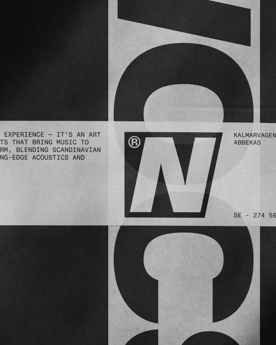
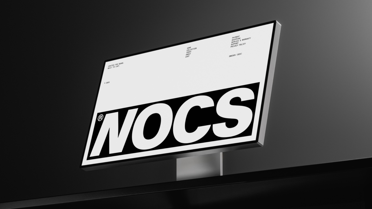
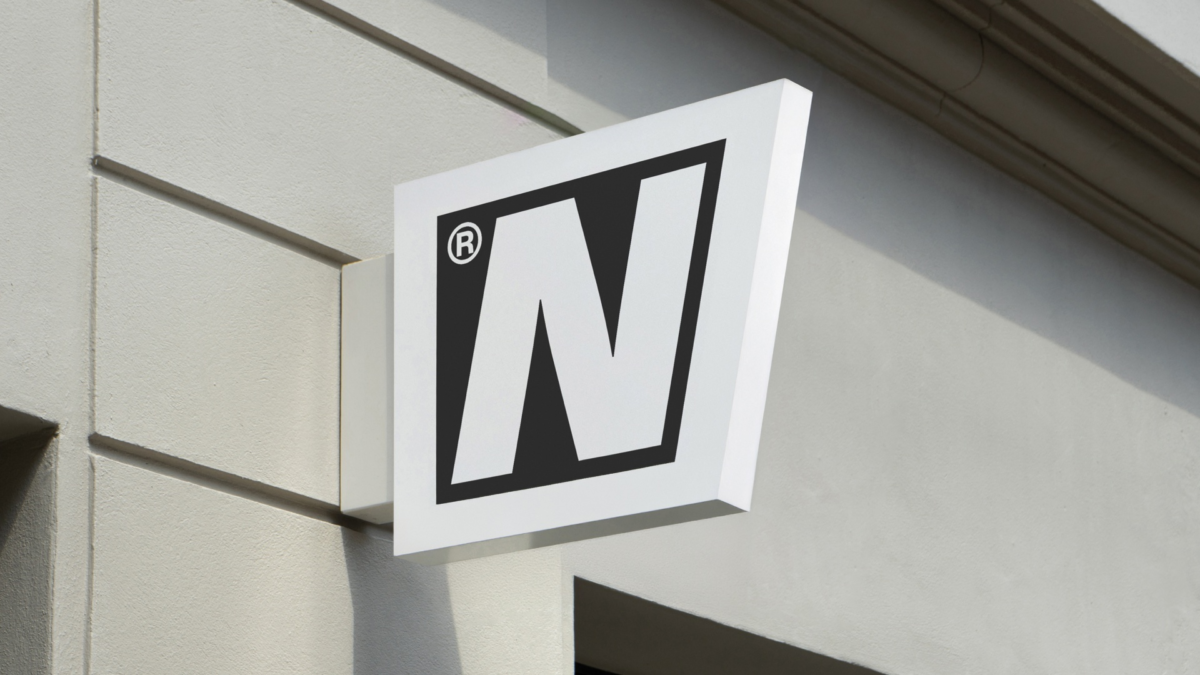
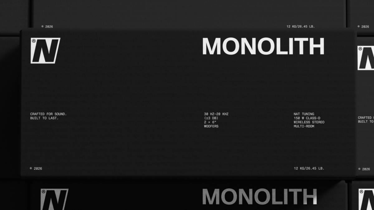
To create an identity connected to its products, we looked directly to NOCS’ industrial design. The logotype draws on the products’ clear lines and archaic, monolithic forms. Its forward-slanted N introduces a sense of progression, connecting NOCS’ stripped-back aesthetic with its approach to technology and future-facing product design.
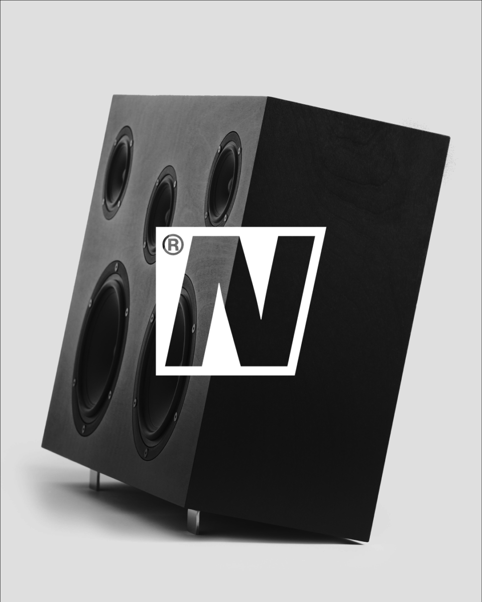
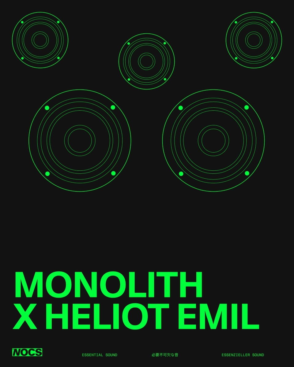
The symbol follows the same principle of reduction. Its geometry is derived from the silhouettes and forms found across NOCS speakers, reducing the physical objects to their most essential shapes.
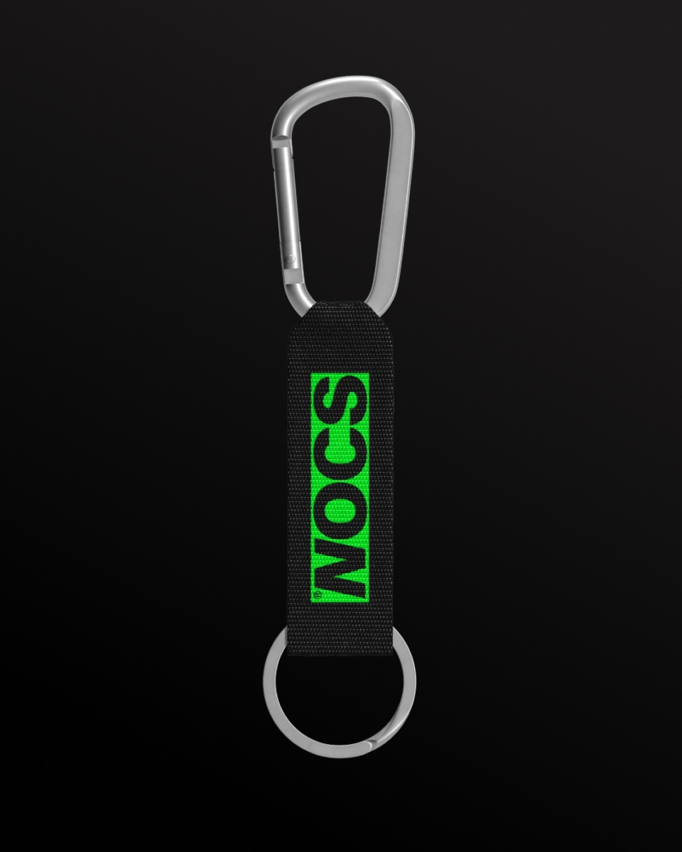
Color was kept restrained with intention. Black, white, and a spectrum of grays create a neutral foundation around the objects, while a bright “high-voltage green” takes cues from the small indicator lights found across audio electronics: a signal of energy, vitality and sound in motion. The contrast allows the brand to switch between quiet precision and moments that require being highlighted.
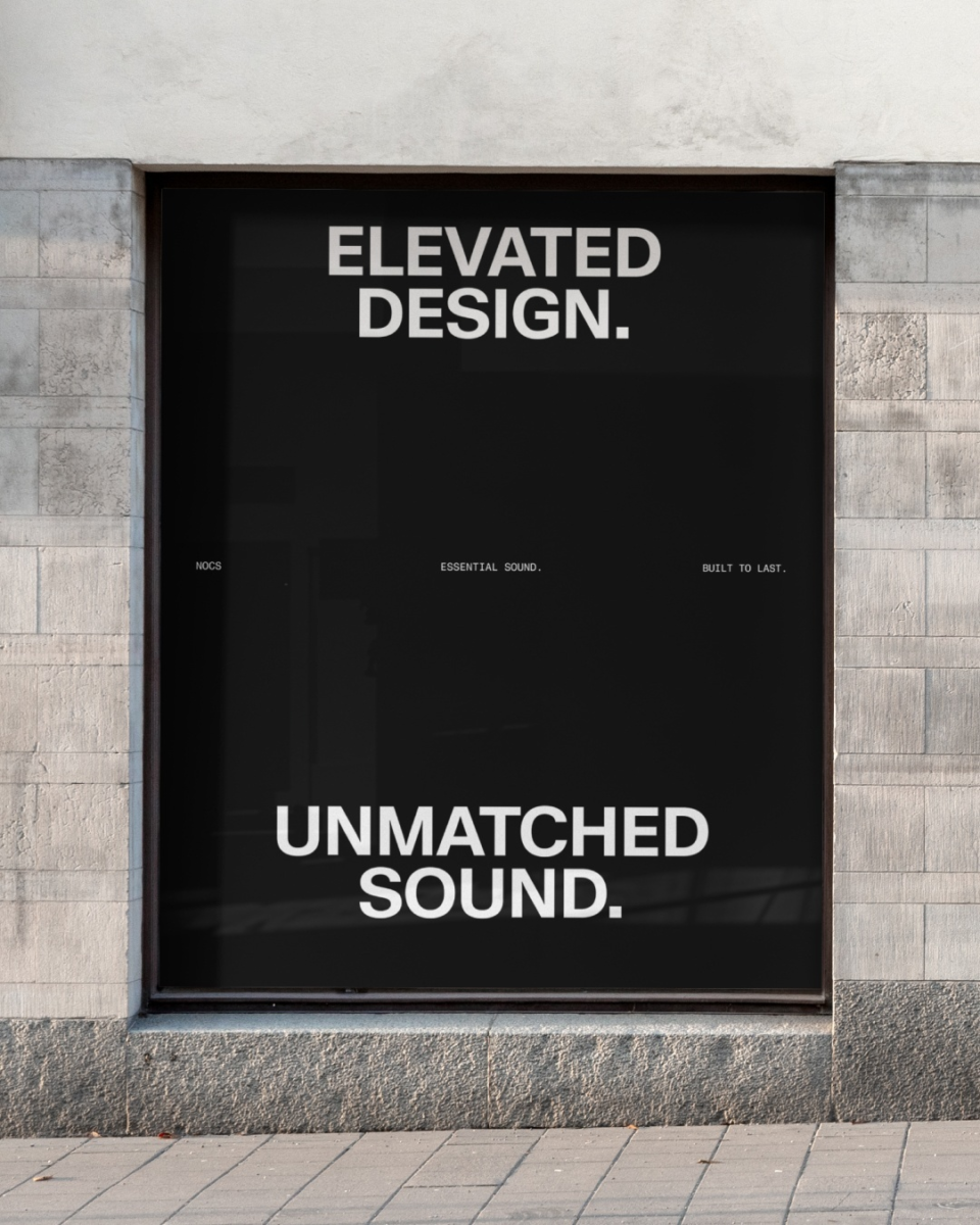
The typography pairs a refined primary typeface with a more technical secondary one. KMR Waldenburg provides the main voice: direct, minimal, and highly functional. Fragment Mono is used for technical information, metadata, and smaller details, introducing a language associated with engineering and production.
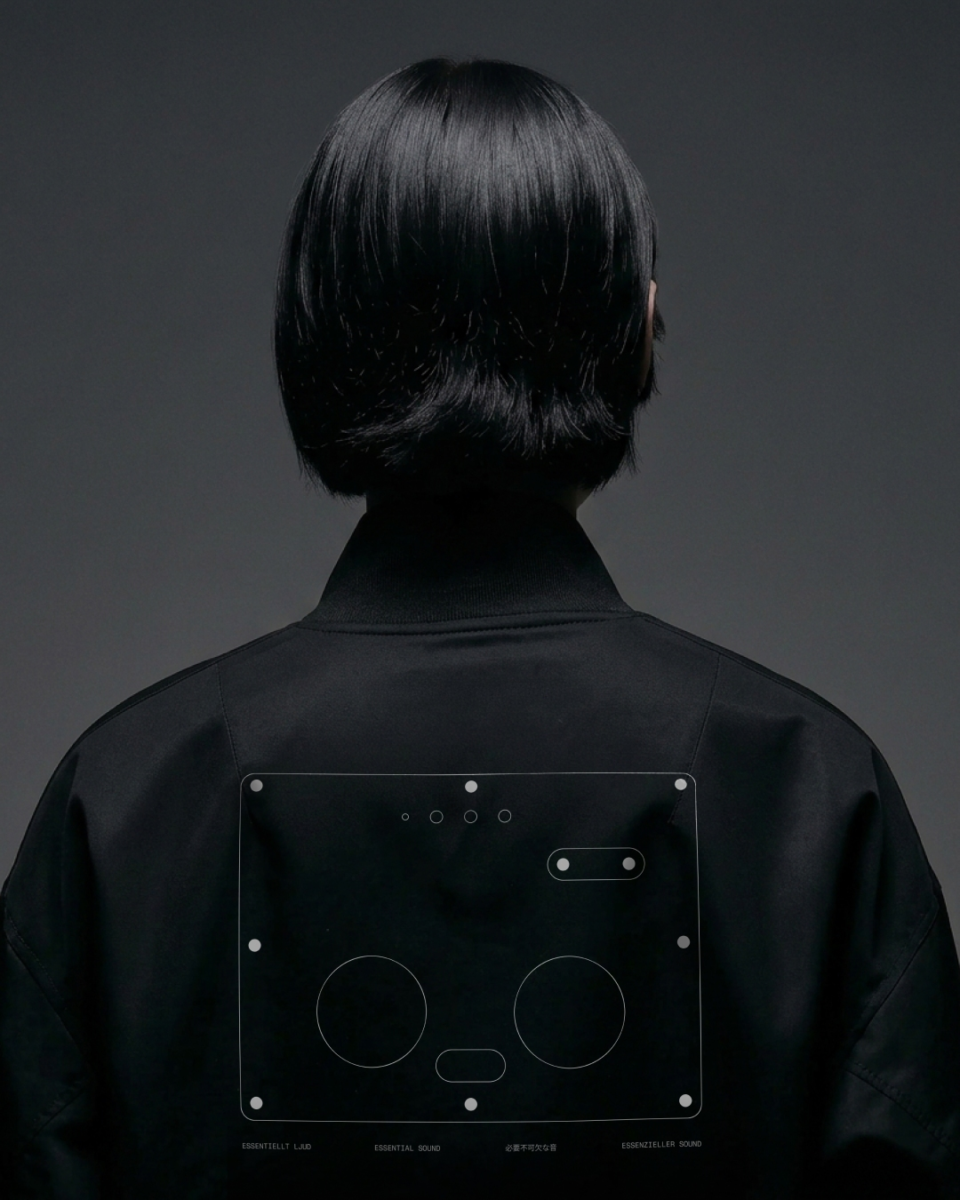
That relationship continues across the wider system. Technical line drawings take inspiration from production plans, exposing the construction of the products rather than concealing it. Photography focuses on material, form, and detail, inspired by Scandinavian design, while allowing the objects to remain the focal point.
Motion translates another part of NOCS into graphic behavior: sound itself. Elements expand, travel, and change in intensity like sound waves moving through space before gradually fading away. The same principle carries into digital layouts, giving the identity a way to move without relying on decorative effects.
The result is a comprehensive brand system that redefined NOCS, creating a more coherent and distinctive expression across every touchpoint. Built around the belief that great design should be felt, appreciated, and made to last, the identity reflects NOCS’ approach to creating everlasting sound objects rather than disposable products. That commitment is tangible: not a single NOCS speaker has ever been returned.